Qwilr Page Design Tips
Improve your Qwilr Page by following these design tips from the Qwilr Digital Design Team!
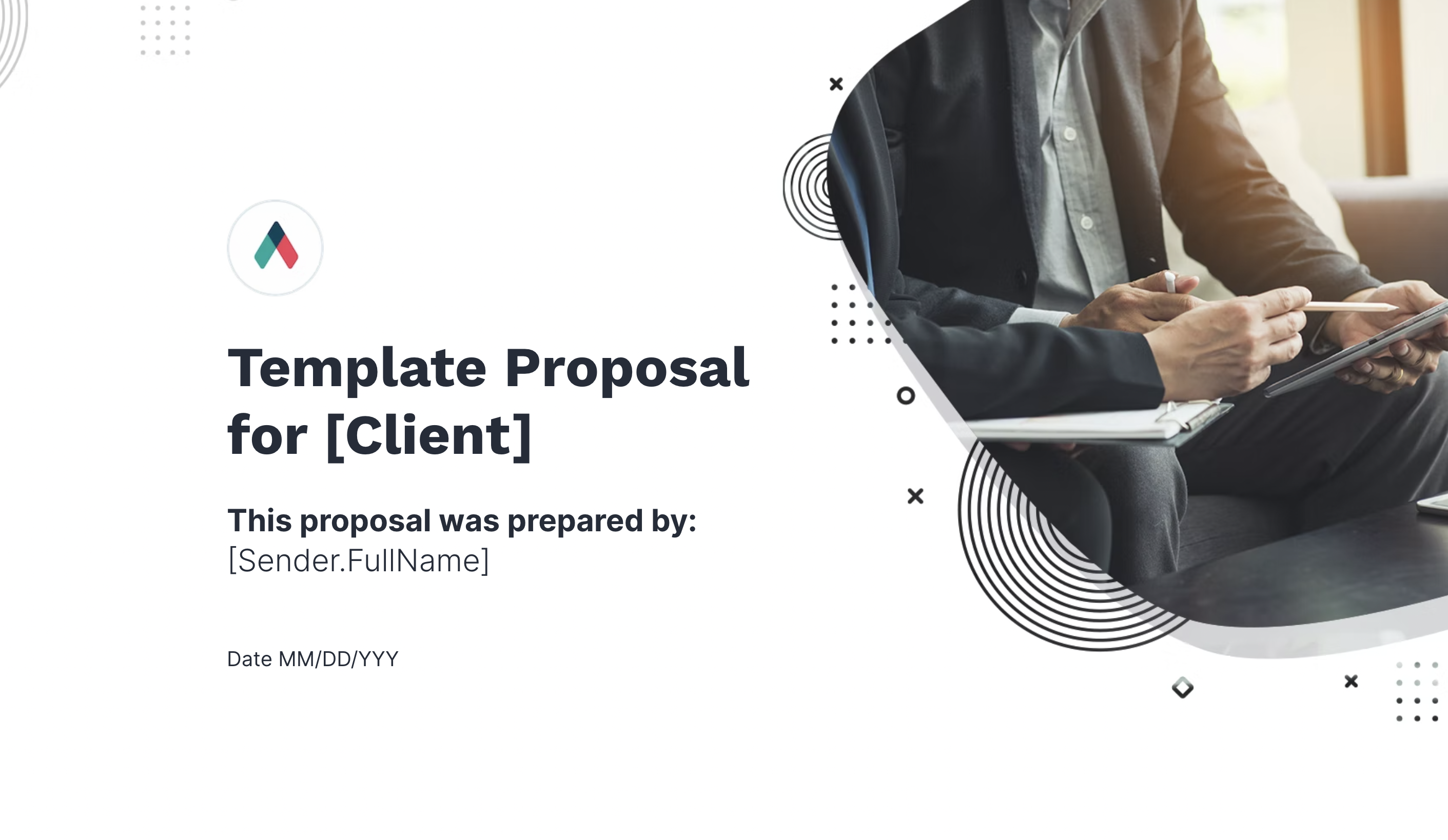
Tip #1: Hero Block
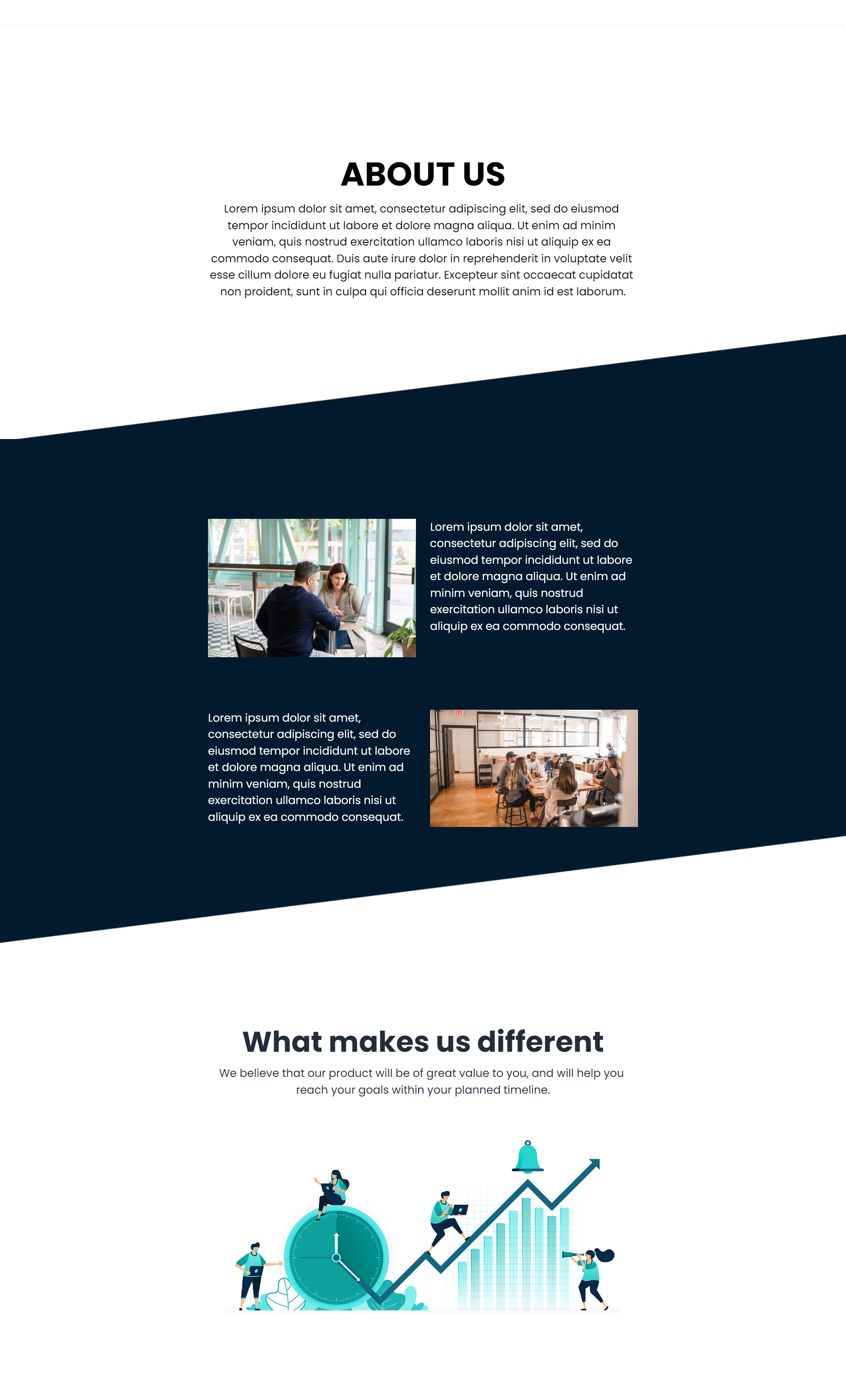
The Hero block is the first section your customer will see when they open your Qwilr page. Ensure that your page title and any additional information are easy to read and don’t blend into the background—avoid using text colors that are too similar to the background color.
Instead of this:
- Splash image is colorful which makes the texts difficult to read
Do this:
- Add a bit of dark tint to the splash block to help the texts pop out and easier to read.
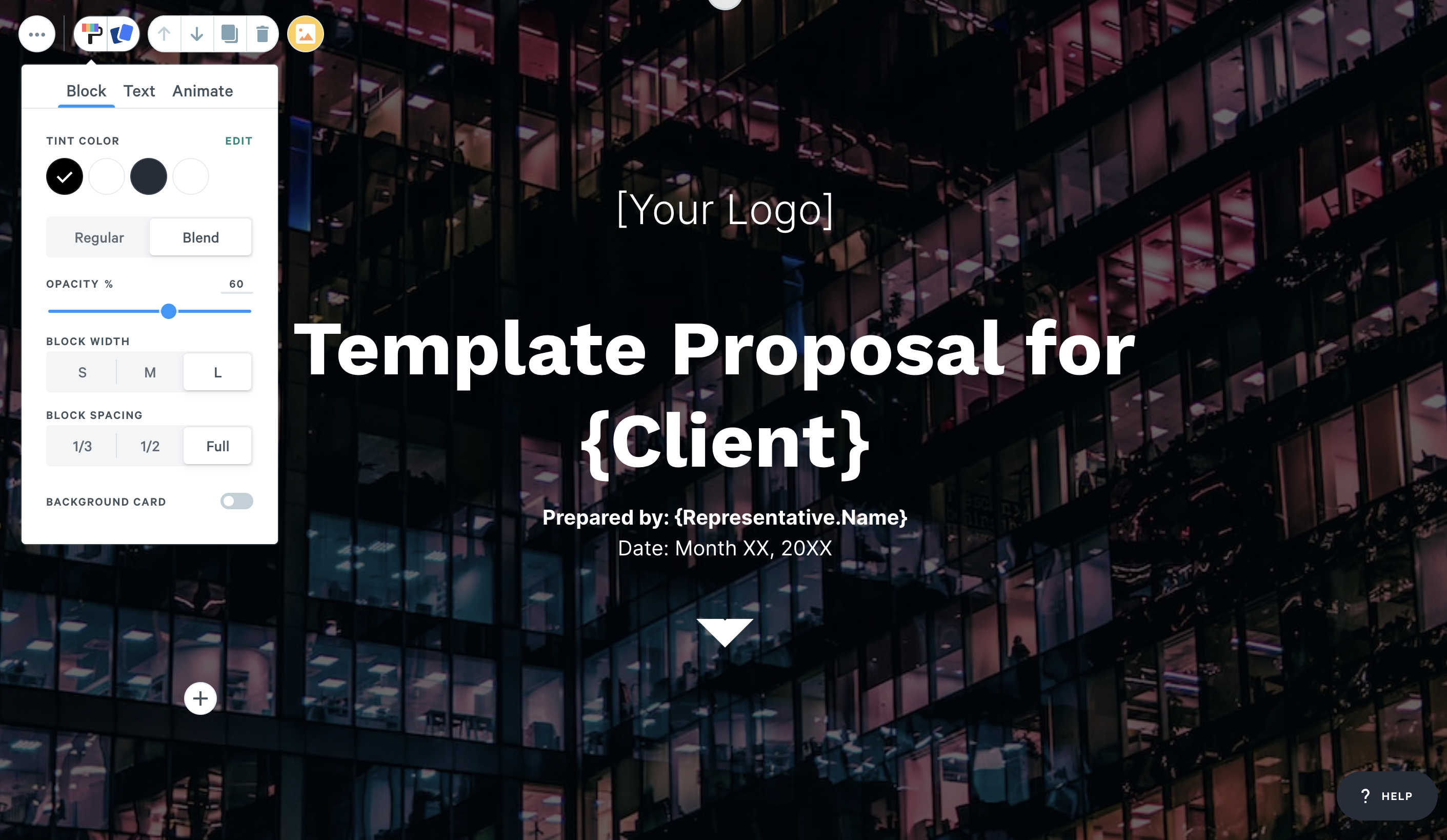
An additional tip is to set the spacing to Full so the block expands to your screen height.
If you don't want your whole block tinted, you can also use our background card feature. This only covers the text area instead of the whole block as shown below.
If your design is on the right side, you can use our 2 column feature so your texts stay on the left side and won't overlap with your design.
You can also leave your texts left aligned as shown below, instead of moving them to the center.
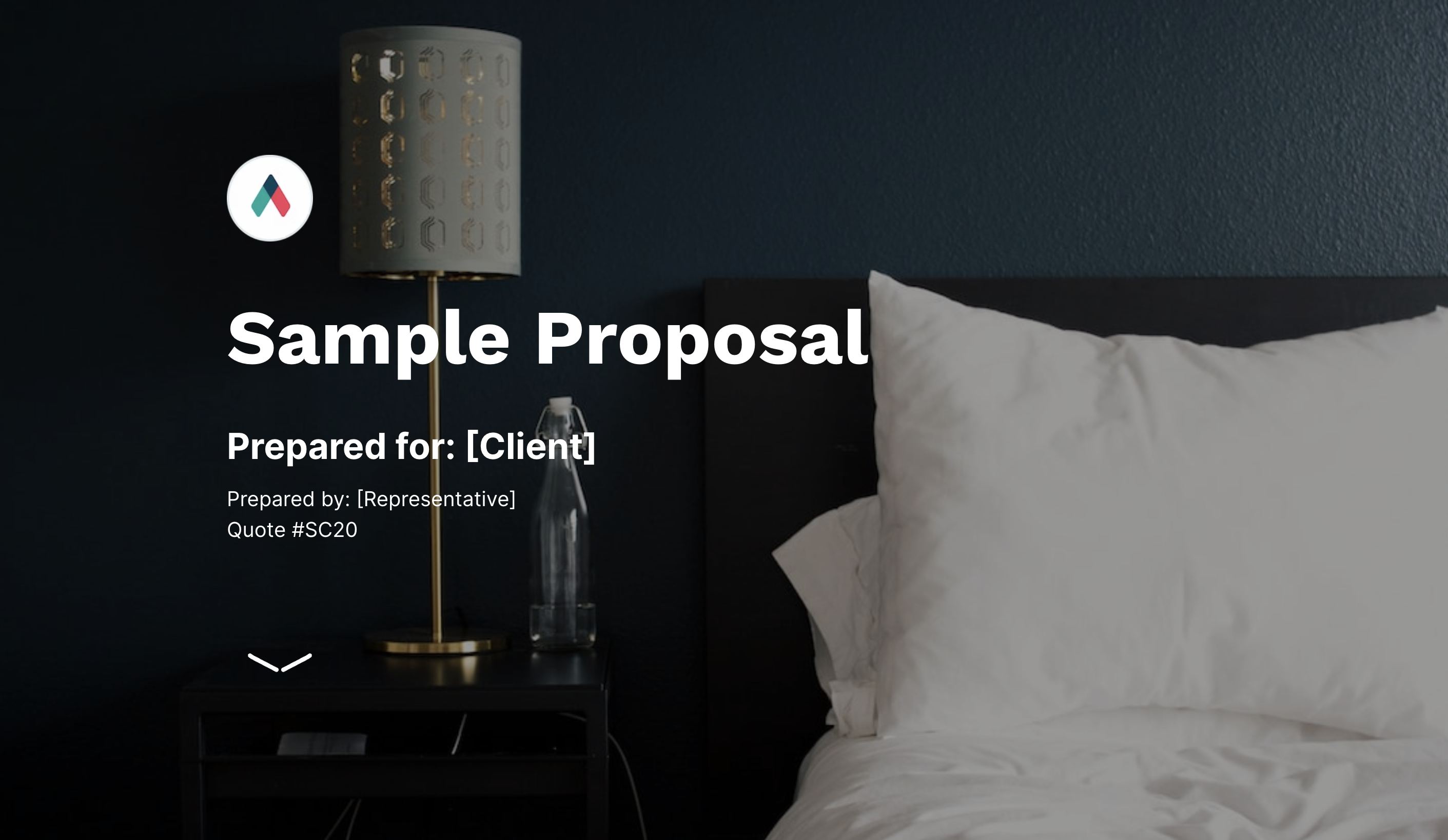
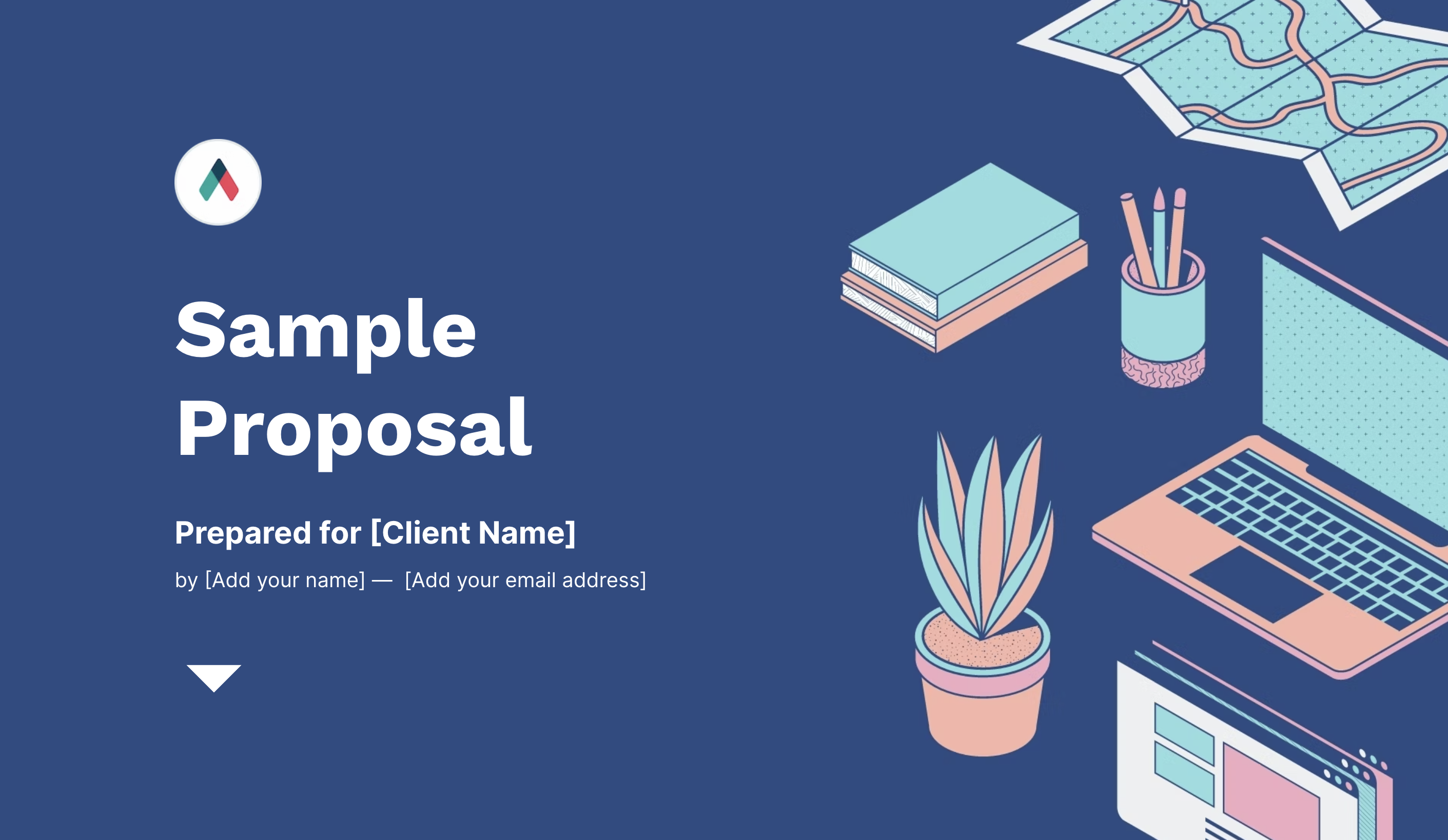
Tip #2: Splash Blocks
(Image)
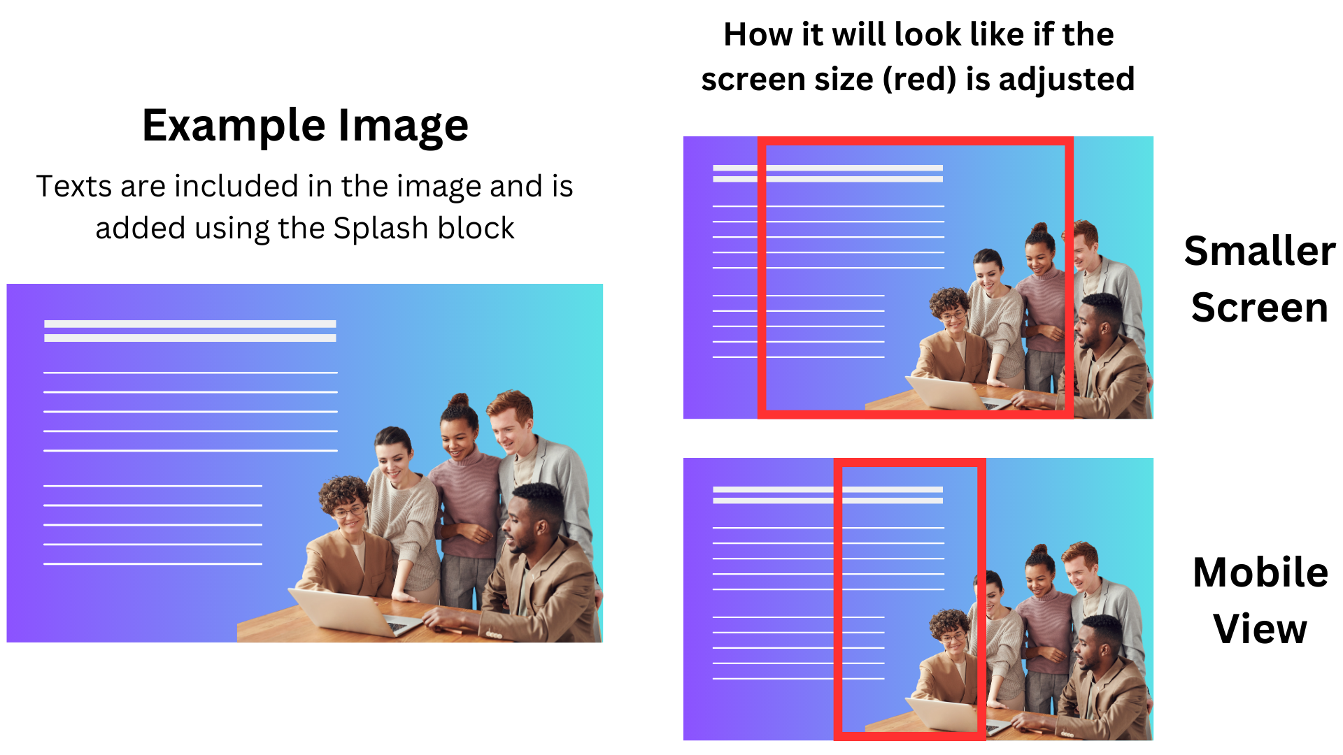
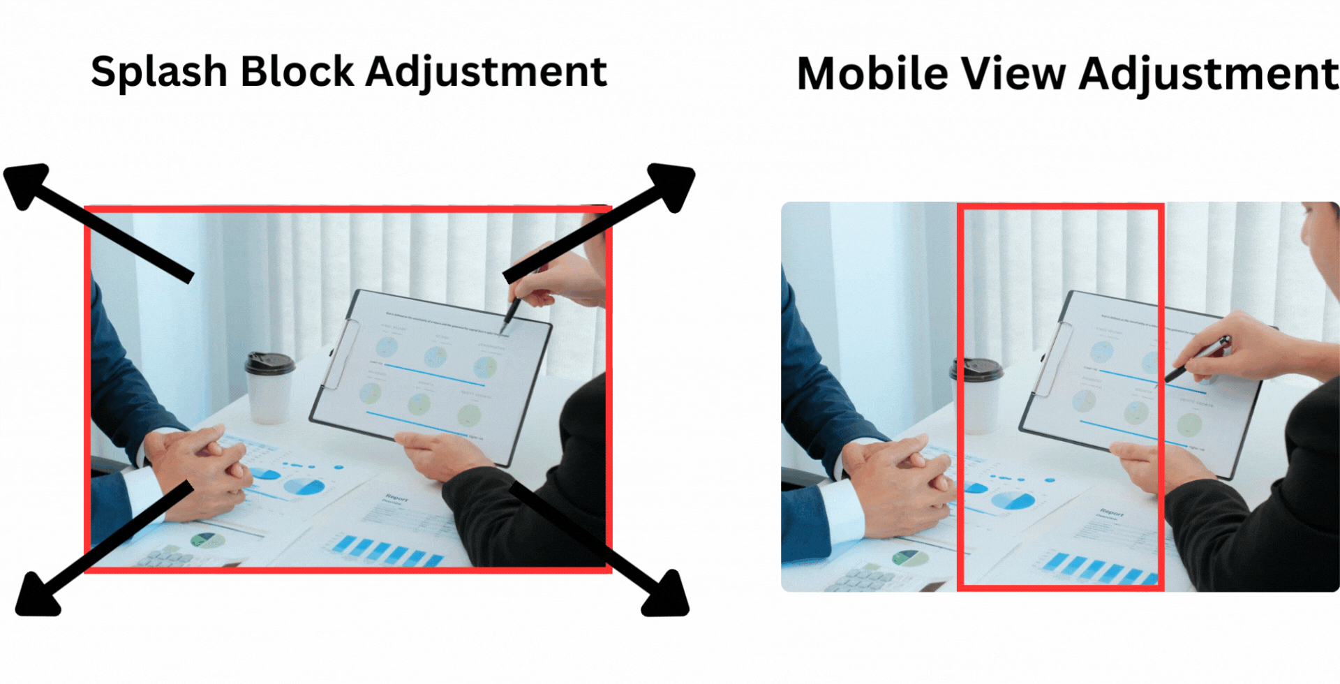
1. Splash Image Adjustment
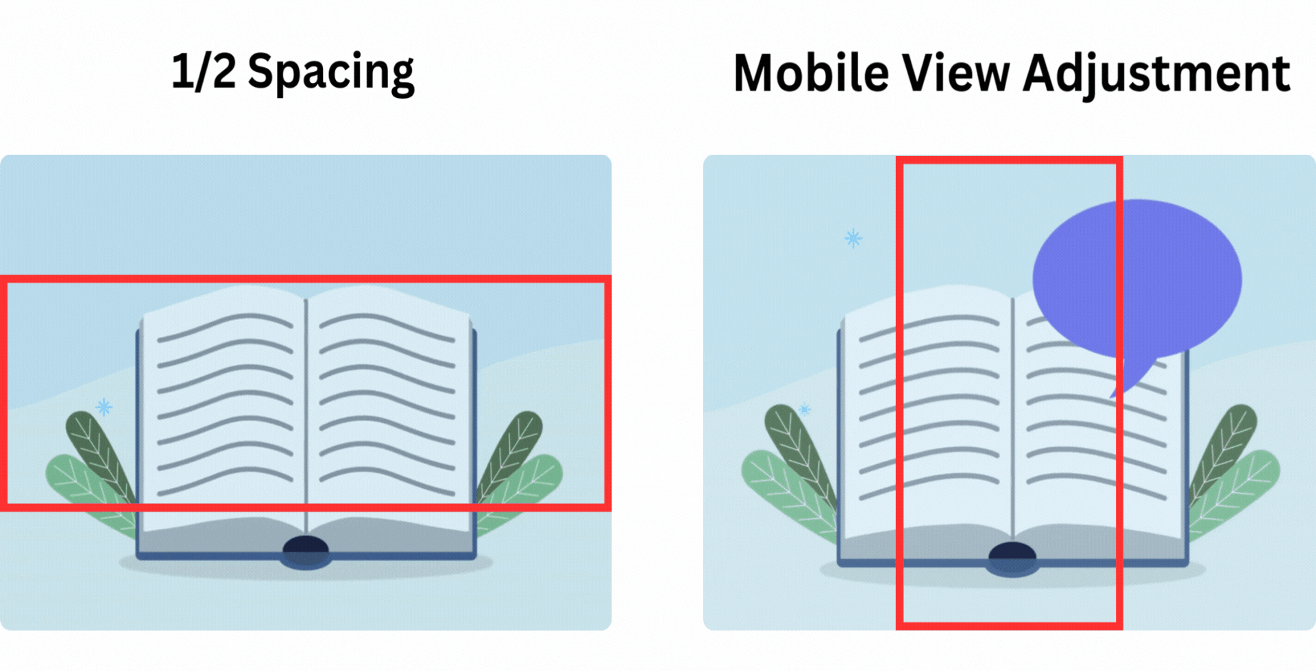
Splash images adjust from the center outward, so it’s important to position key elements—like faces or focal points—right in the center to avoid them being cut off.
On mobile devices, only the center portion of the image is consistently displayed, and its width will vary depending on the screen size.

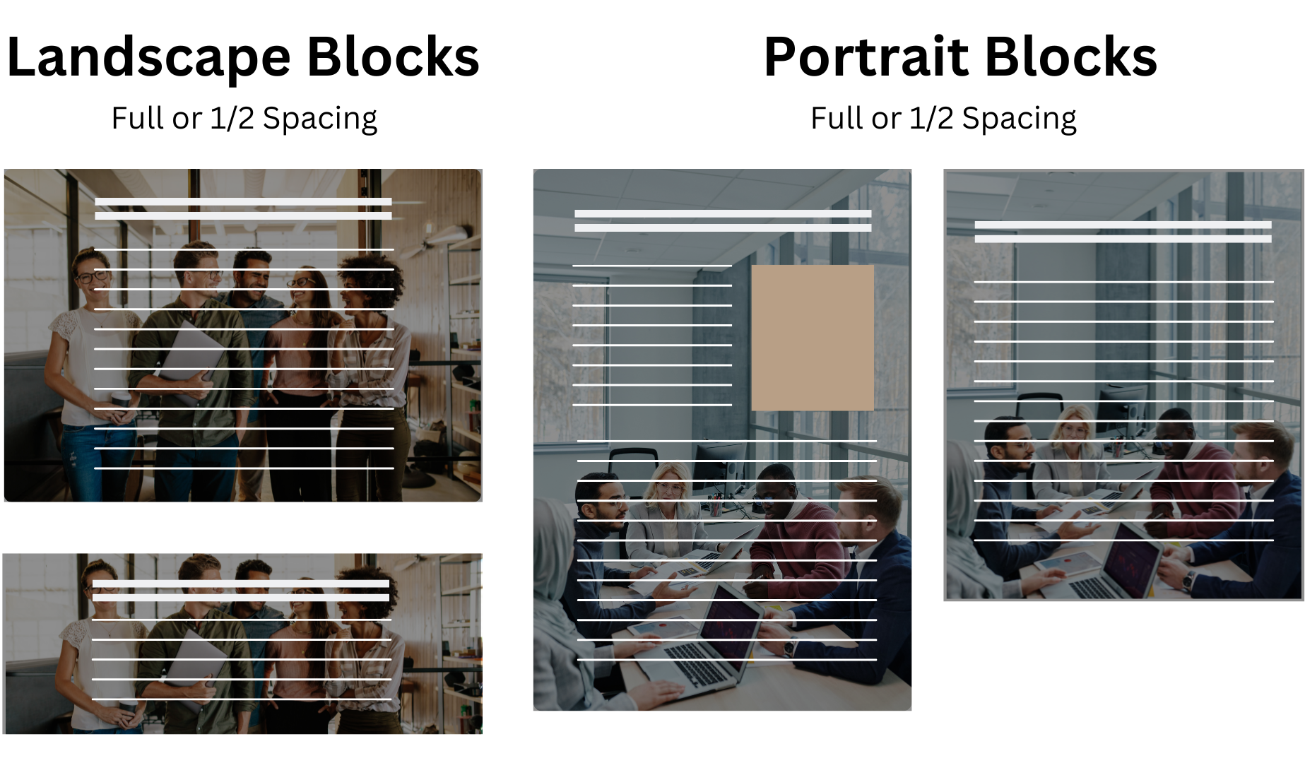
2. Content
A Splash block will gradually extend from a landscape to a portrait layout depending on the amount and type of content added (e.g. large text sections, images, videos, multiple accordions, etc.). When a landscape background image is used in a content-heavy block, it may zoom out and become pixelated.
Solution: Use portrait-oriented background images for blocks with a lot of vertical content, and landscape-oriented images for blocks with minimal content to maintain image quality and layout consistency.
Qwilr designers often use the 1920 x 1080 px (or higher) image size, then adjusts the height to become portrait version (can be up to 1920 x 1920 px), depending on how it looks in the Qwilr Page they are working on.
In the example below:
- The landscape block works well with a landscape background image when using full, 1/2 or 1/3 spacing.
- The portrait block will ignore full, 1/2 and 1/3 spacing once it extends beyond the height of the screen.
3. Background with Texts
Avoid using images with text as splash backgrounds, as there’s a high chance the text will be cut off depending on the screen size (e.g., mobile, tablet/iPad, or smaller and larger monitors).
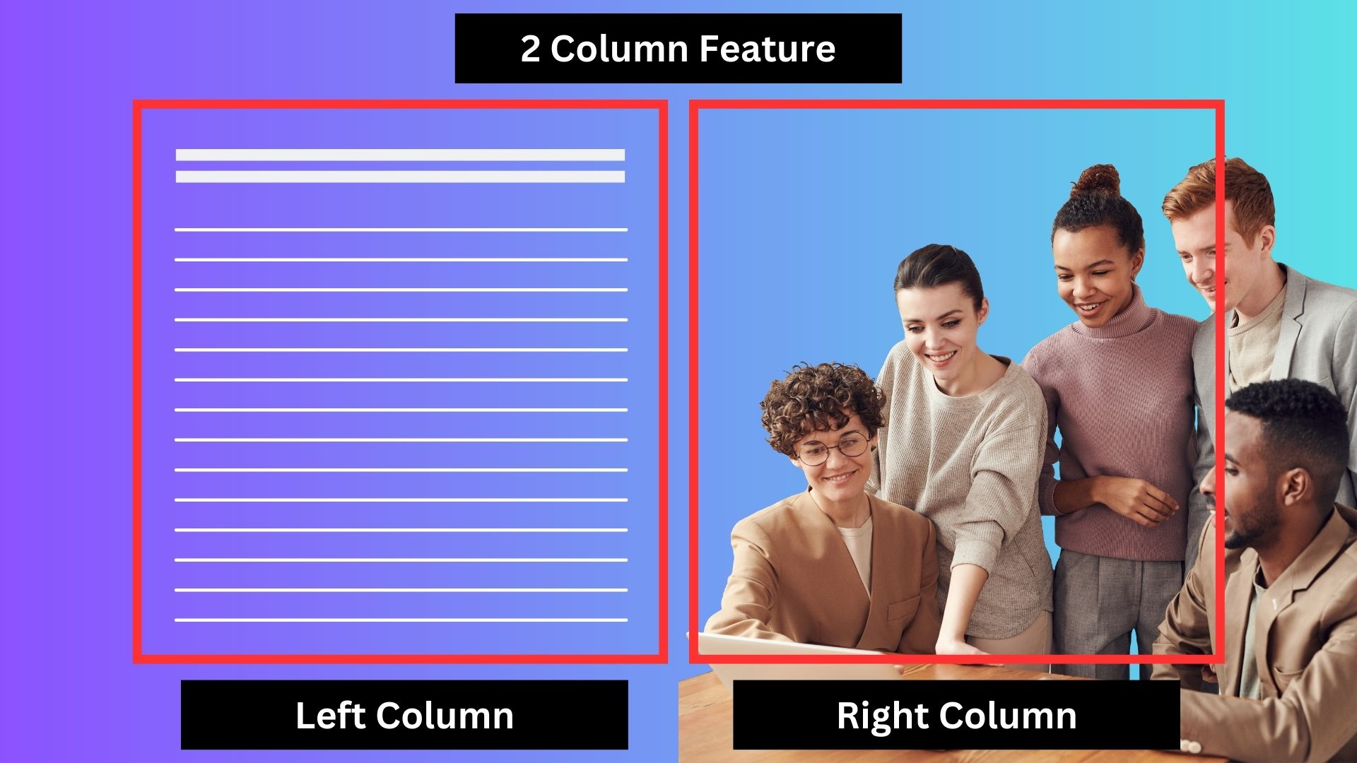
You can use a background image in the splash block and add text and additional images using the two-column feature. This design is responsive on mobile devices, as the two columns will automatically stack vertically—left column on top and right column below.
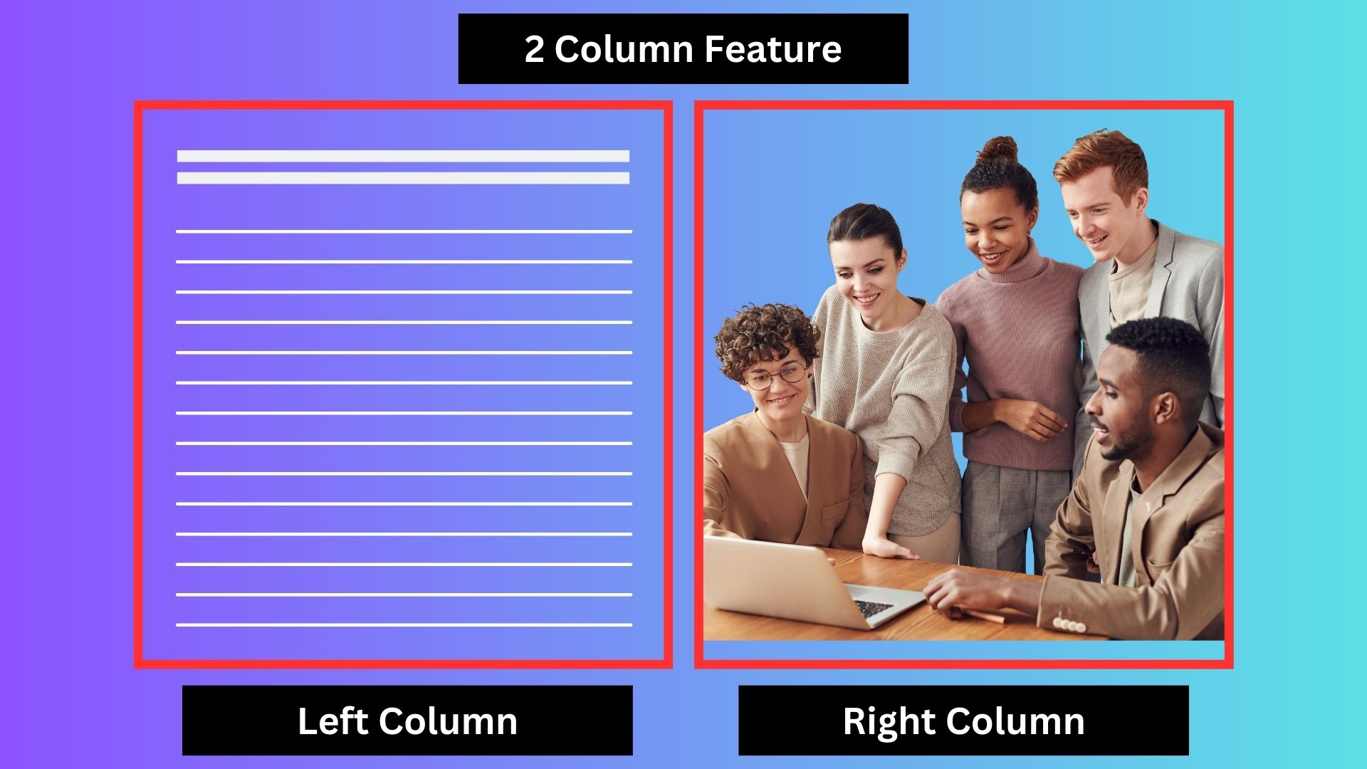
You can use a splash background featuring people and add text using the two-column layout, making sure to leave the right column blank so the text doesn’t overlap with the people (or vice versa). This design is mobile-responsive, with the two columns stacking vertically—left column on top and right column below. However, keep in mind that on mobile, only the center portion of the splash background image will be visible.
Additionally, if you want to maintain this look on the web but avoid awkward cropping on mobile, you can shift the image with the people toward the right so it occupies about one-third of the background (usually the gradient area). This way, the people won’t appear in the mobile view, preventing unwanted cropping.
Tip #3: Splash Blocks
(Video)
1. Splash Video Adjustment
Splash videos adjust starting from the top center, expanding outward.
Full, 1/2, or 1/3 spacing — the video will adjust in the same way as a splash image. See the example below.
NOTE: In mobile view, just like with splash images, only the center area of the video is always visible. However, the video will stop playing and instead display the video thumbnail.
2. Background with Texts
As with splash images, avoid using explanatory videos that include text as splash video backgrounds, since the text may be cut off depending on the screen size (e.g., mobile, tablet/iPad, or various monitor sizes).
If you want to add videos, it’s best to use our Video Block or Inline Video feature instead. Here's how.
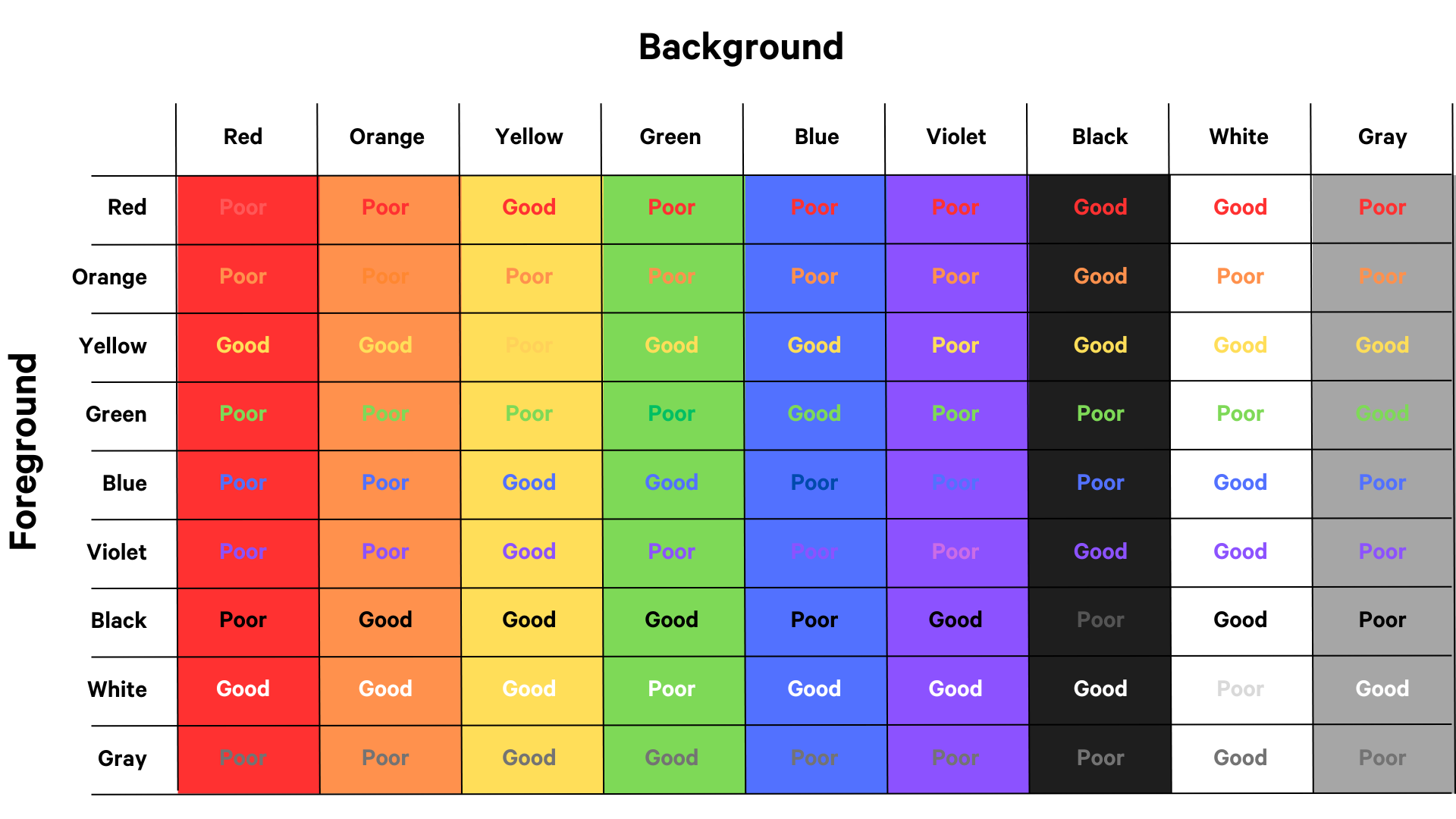
Tip #4: Colors
Placing contrasting colors as background and texts
Check out the chart below for examples of effective and ineffective background and text color combinations.
Tip #5: Text Hierarchy and Readability
Visual hierarchy is crucial for any design –
When done correctly, it makes the design stronger and more effective. In today’s article, we’ll explore the concept of text hierarchy, share best practices, and explain how it impacts the reader. So, let’s dive in!
In short, text hierarchy helps organize content so the audience can engage with it smoothly and intuitively.
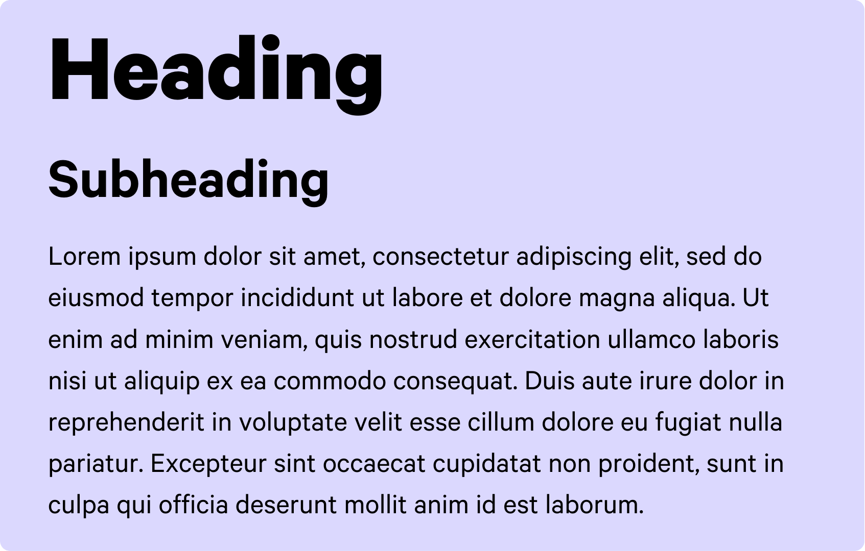
Here’s a basic breakdown of text hierarchy:
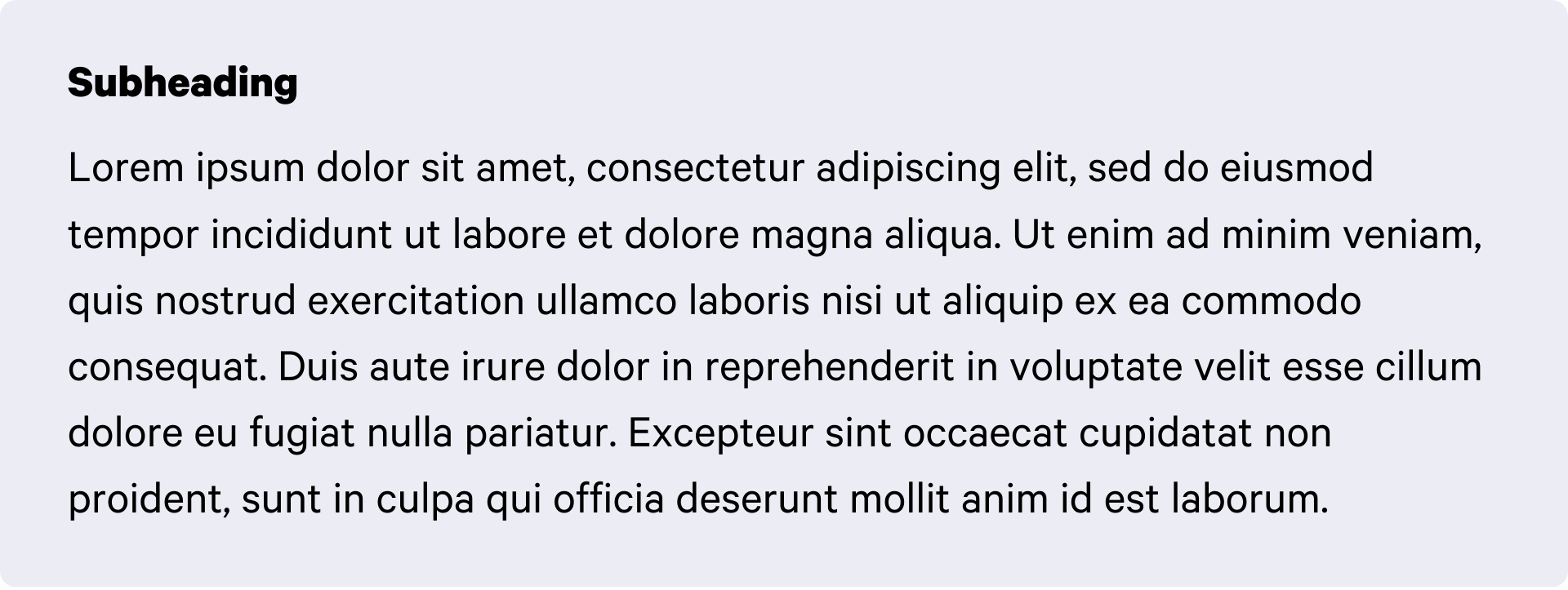
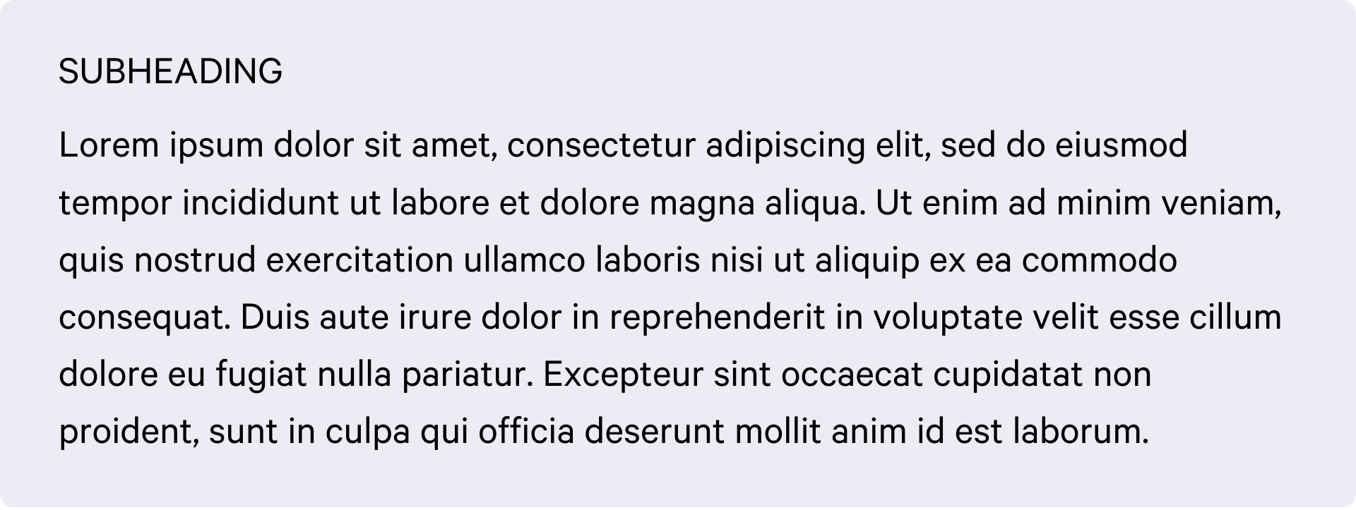
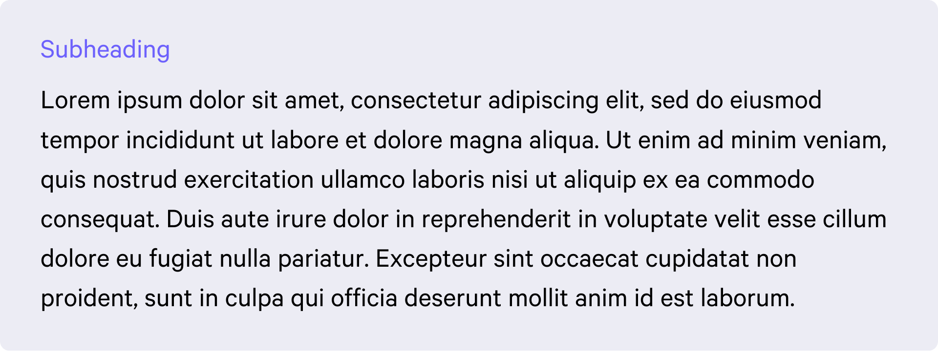
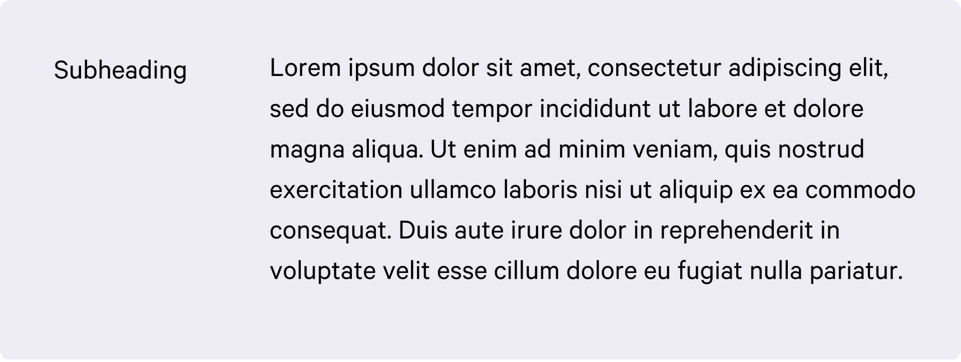
- Heading
- Subheading
- Text body
Several factors contribute to establishing a clear visual text hierarchy, including size, weight, style, color, position, type, and spacing. Typically, two or more of these elements are combined. Let’s take a closer look at each one.
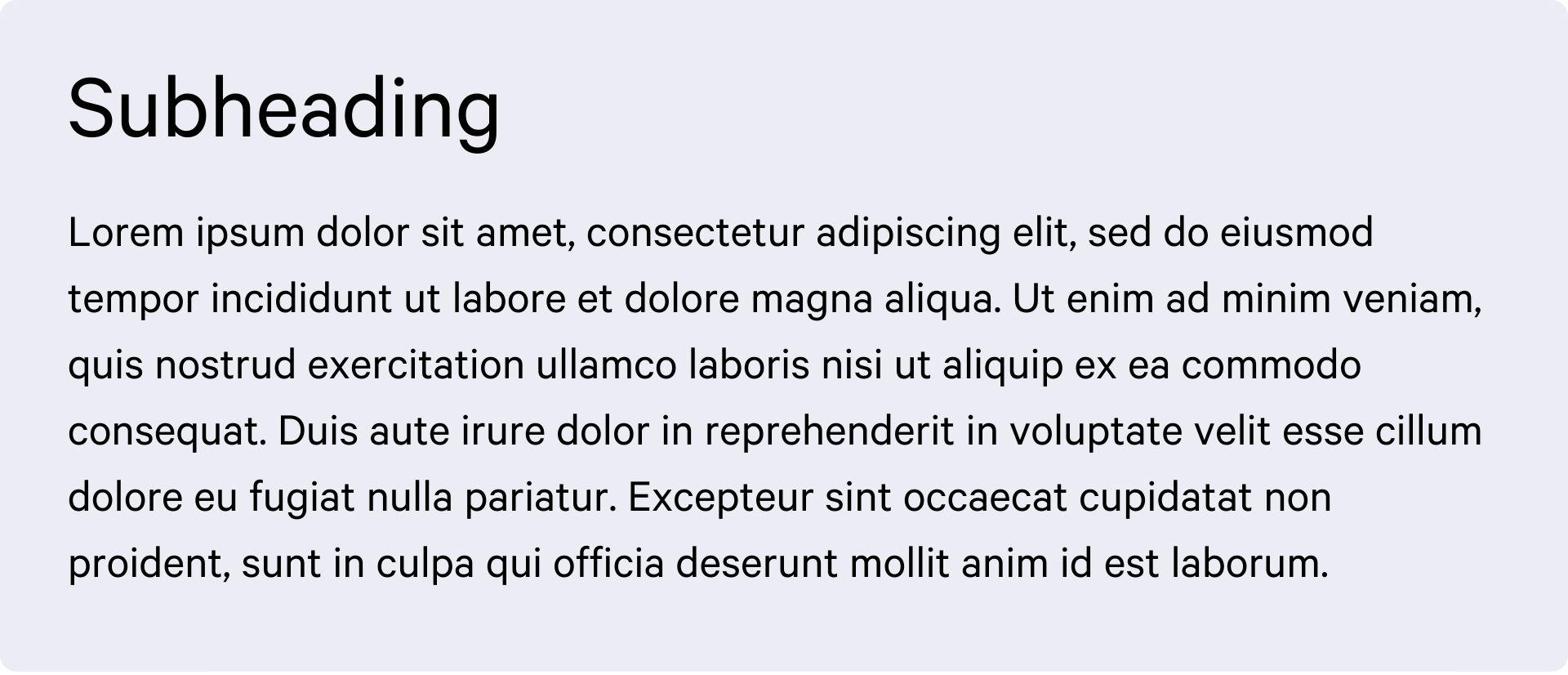
Size is the most intuitive way to create hierarchy—larger text naturally draws more attention and signals greater importance. Headlines are typically set at 65px or larger to stand out, while subheadings and body text usually range between 20px and 40px.
Font weight also naturally establishes text hierarchy. Heavier, bolder fonts have a stronger presence, which is why they’re often used for headlines. In contrast, regular and thin fonts have a more neutral and elegant look—their lighter strokes draw less attention, making them ideal for body text.
Using different font styles can also help establish a clear text hierarchy. For example, all caps tend to appear stronger and more attention-grabbing, making them ideal for headlines. This can be followed by italic styles for subheadings, with regular styles reserved for body paragraphs.
Color plays an important role in organizing your text, and the choice of color is closely tied to color psychology. Warm colors tend to be more attention-grabbing than cool colors, making them effective for highlighting key information. At the same time, incorporating your brand colors can help strengthen brand recognition and consistency.
The position of text also plays a big role in establishing hierarchy. Take CV layouts, for example: headlines and main bullet points are typically aligned on the left, making it easier for readers to scan the content. Meanwhile, descriptions and paragraphs are placed on the right, directly across from their corresponding titles for clear association.
A bold display font for the headline paired with a neutral, thin font for the body text? Absolutely. This combination creates strong contrast and a clear hierarchy that’s easy to recognize. When using different typefaces in one design, always select complementary fonts that maintain this high level of contrast.
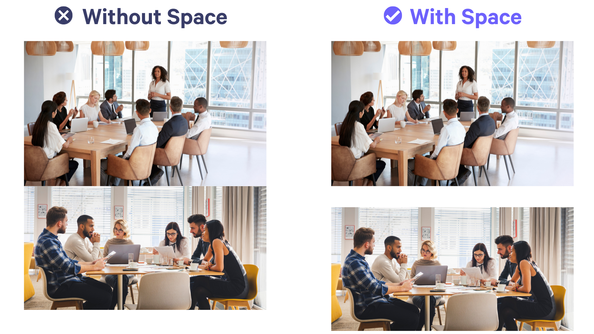
Tip #6: Image Spacing
Always leave some space after images by clicking on your image, then pressing ENTER on your keyboard. Alternatively, you can set the top spacing of the text to 1, or use SHIFT + ENTER before the text to add an extra space.This helps create a cleaner, more visually pleasing layout. Here’s how they look side-by-side:
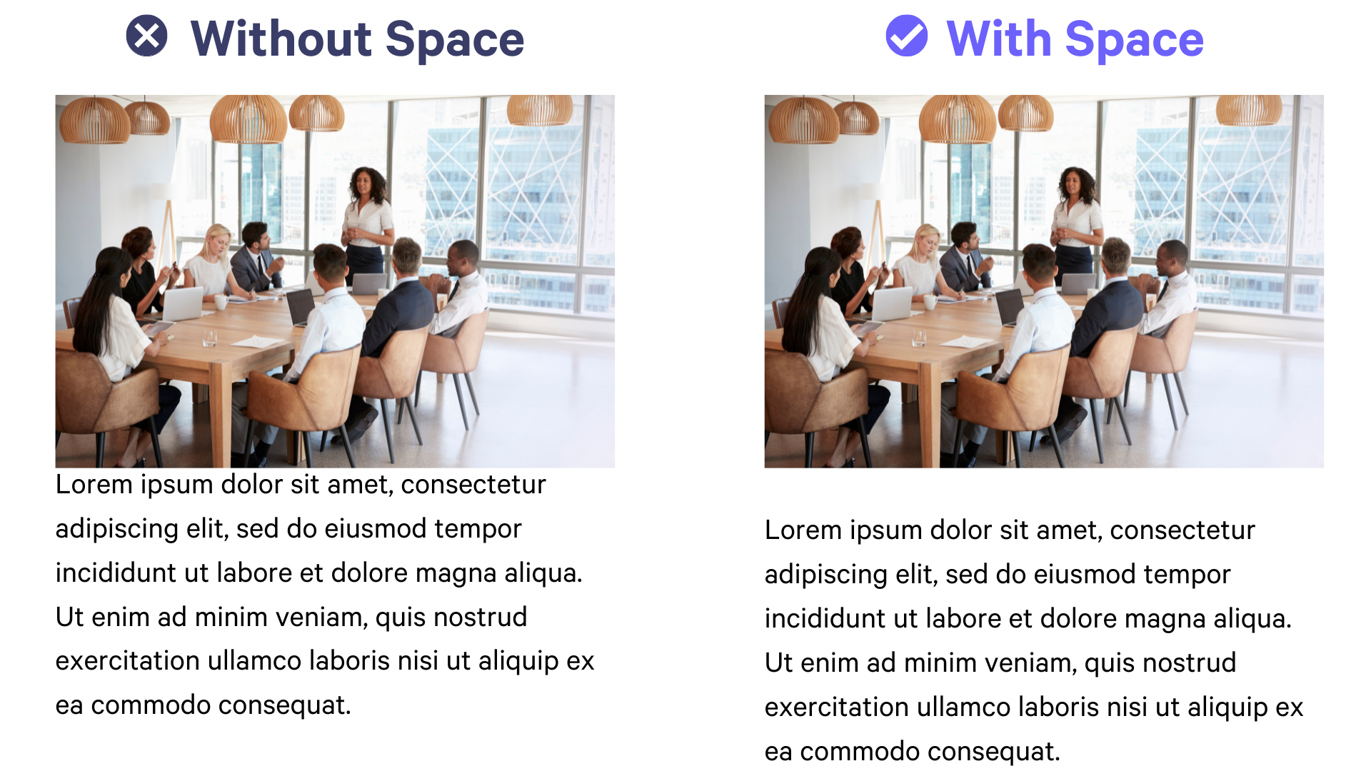
This also applies to images:
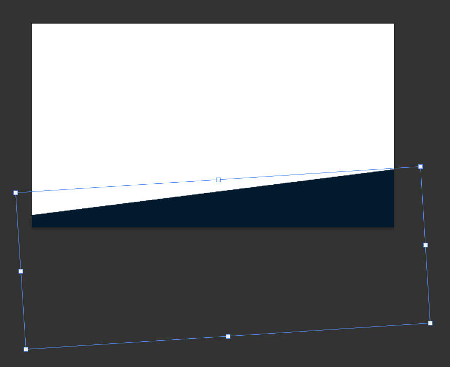
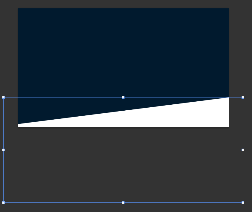
Tip #7: Seamless Background
One great way to design your page is by creating a background that flows seamlessly across blocks. What does that mean? In the example below, you’ll see a dark background transitioning smoothly into a light background—without the usual straight gray line that typically appears between blocks. This technique is perfect for achieving a smooth, continuous flow on your page.
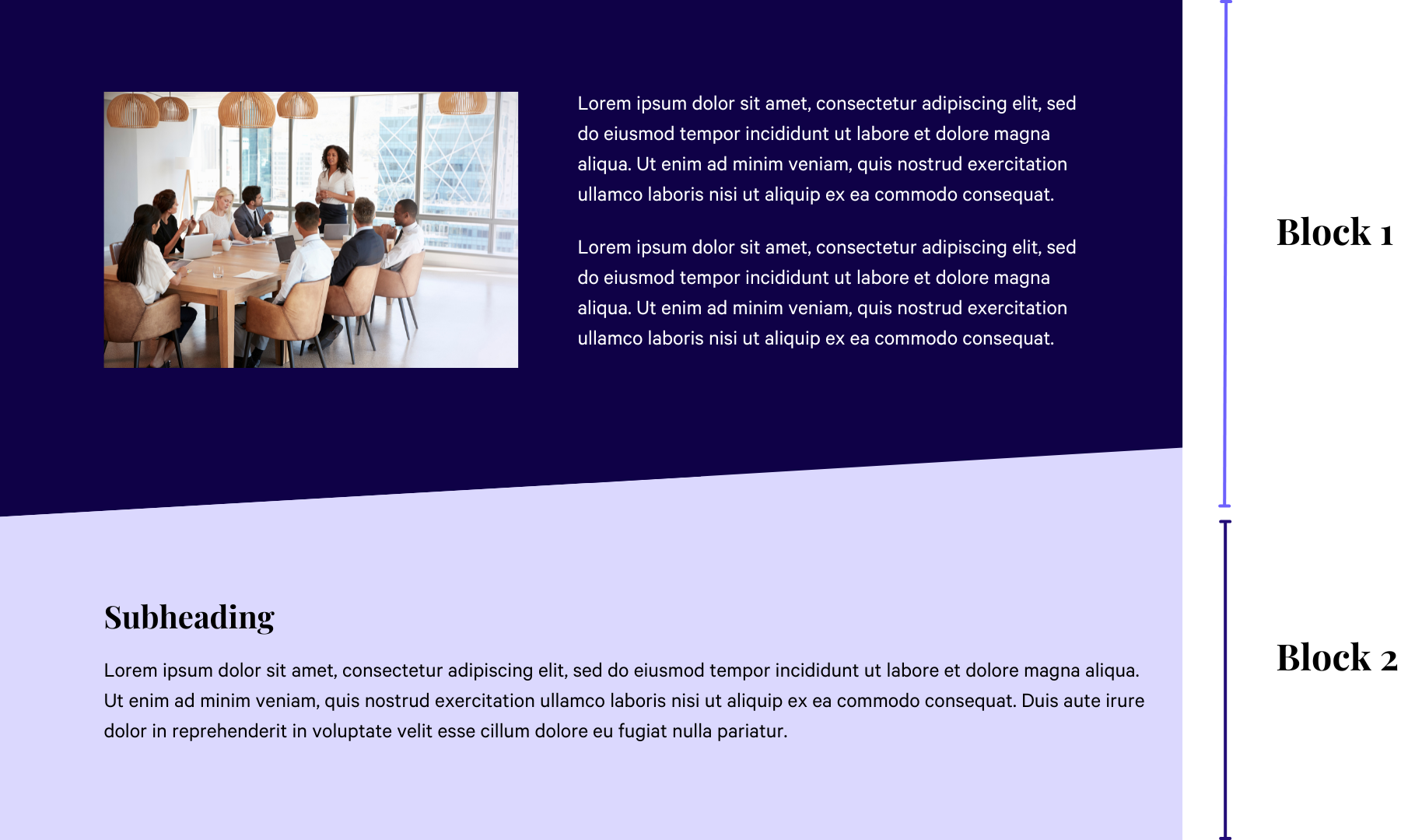
Here’s how you can do this:
Create the background in Canva or Photoshop by making a slanted rectangle (or any shape you prefer), then stretch it across the entire canvas and fill it with your chosen color—using your brand colors is recommended. It should look something like this:
Add a splash block and upload your background.
Match the color of the next block with the previous block. It would look something like this:
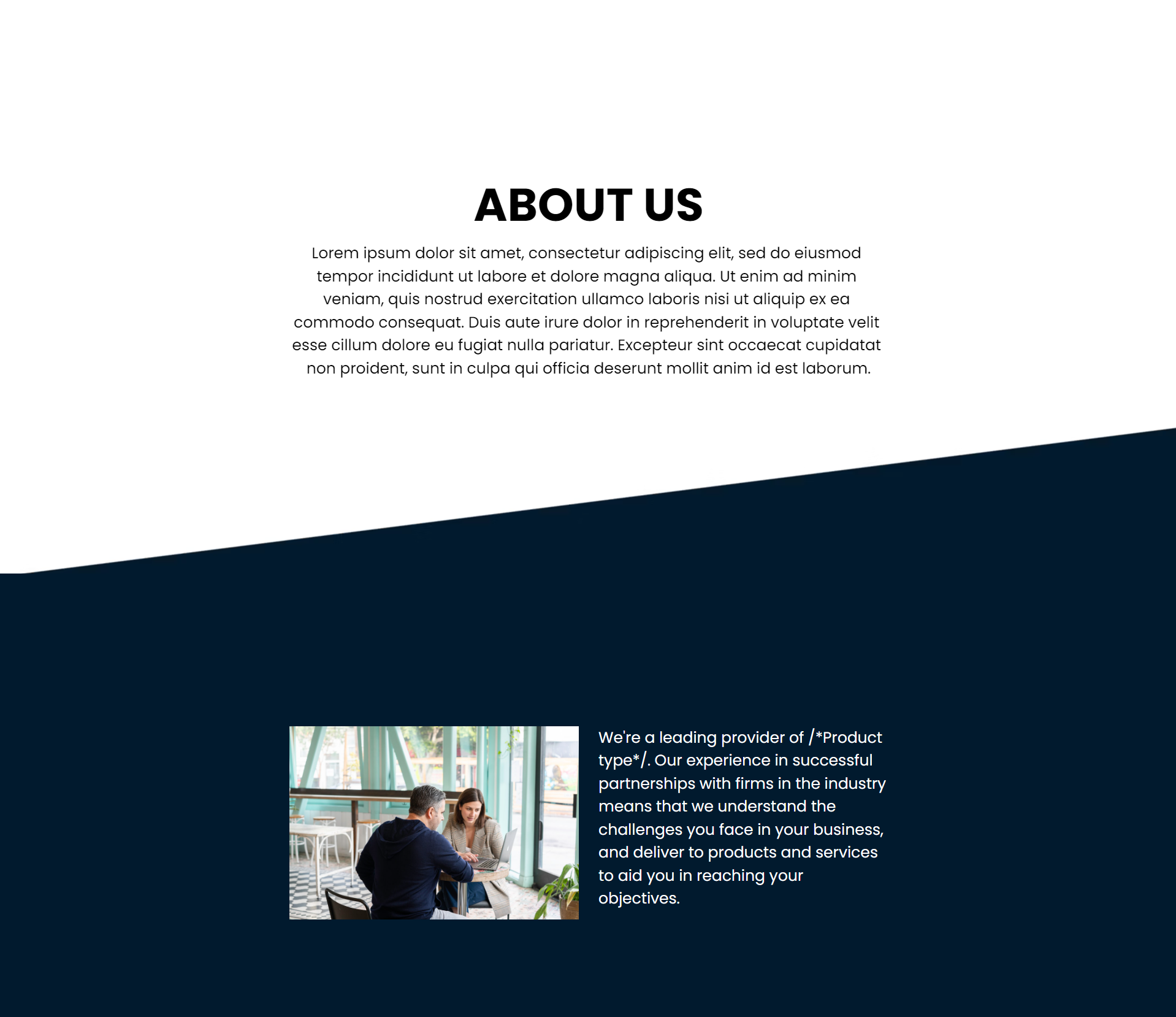
You can extend the continuous effect by creating another background with the colors reversed this time.
Be sure to add a second splash block after the first one to upload your second background. The blocks will then appear like this:
Tip #8: Enumeration
There are several ways to number your items using Qwilr’s design features. Here are some examples along with instructions on how to create them:
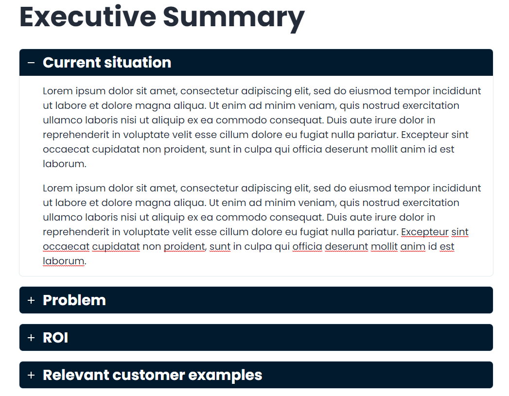
Accordions
The best way to number text-heavy categories is by using Qwilr’s Accordion widget. Simply click the “+” to add a line item, then select “Accordion.” You can customize the accordion settings to suit your needs.
Columns
There are several ways you can use the columns widget. Here are a few examples:
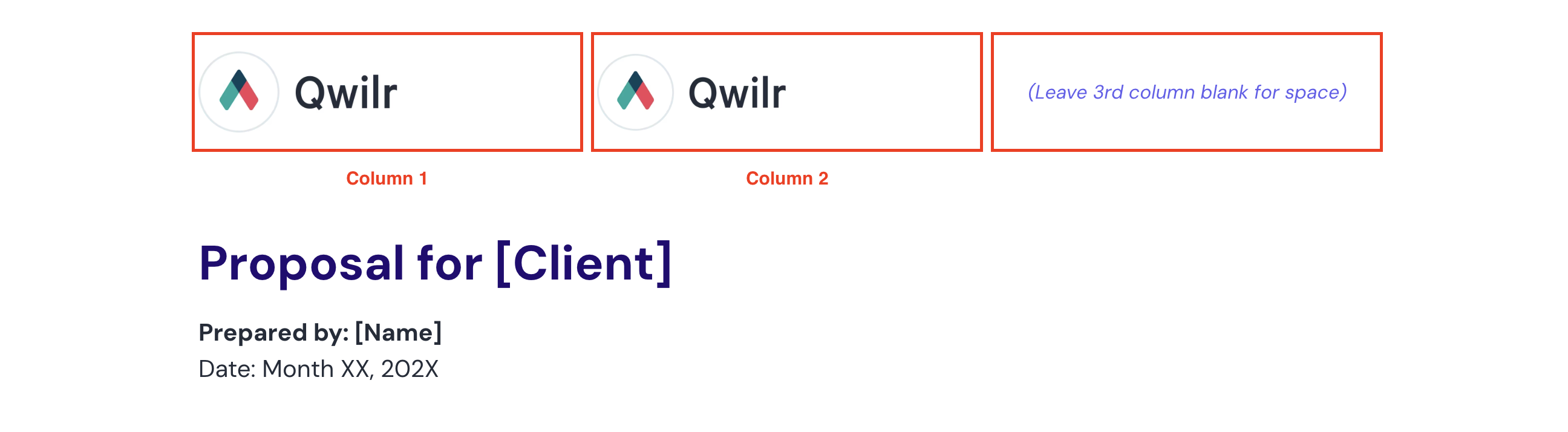
LOGOS: Left Alignment
To set this up, insert a three-column widget, place your logos in the first and second columns, and leave the third column empty. This helps prevent the second logo from appearing too small on mobile devices. Be sure to add a space after the first logo by clicking on it and pressing ENTER on your keyboard.
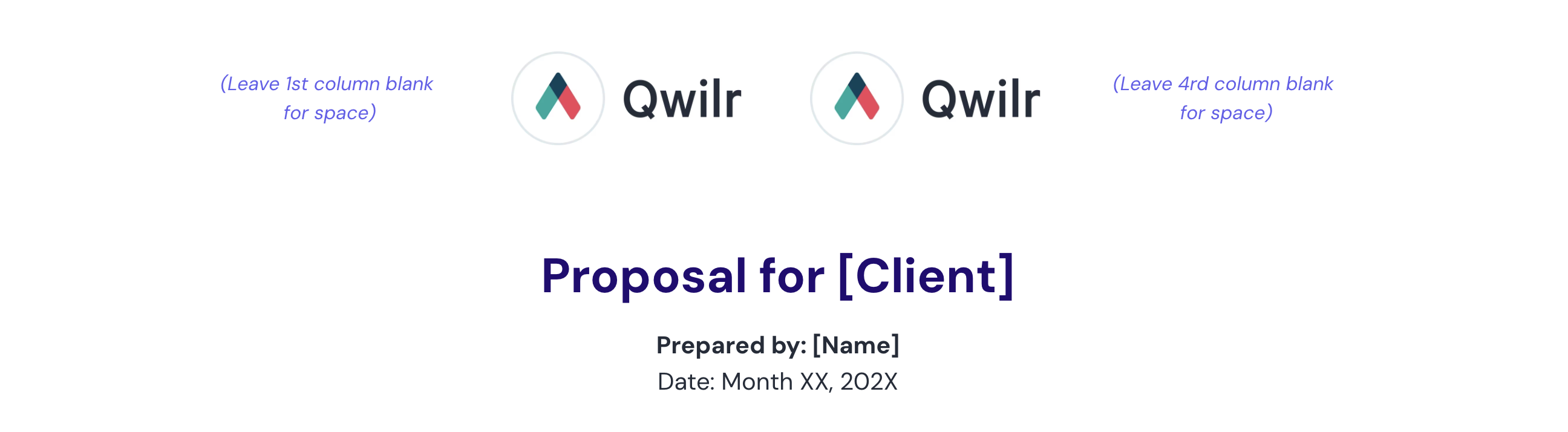
LOGOS: Center Alignment
To achieve this, insert a four-column widget and place your two logos in the second and third columns, leaving the first and fourth columns empty. This setup helps maintain proper sizing and spacing, especially on mobile devices.
LOGOS: Left and Right Alignment
To create it, insert a three or four-column widget and place your logos in the first and third/fourth columns, leaving the middle column(s) empty. This arrangement helps maintain proper spacing and ensures the logos display well on mobile devices.
PARTNER / CUSTOMER or AWARD LOGOS
This layout is great for displaying customer or partner logos. Use multiple columns to showcase the logos side by side, and make sure to adjust the spacing between columns for a balanced look. To maintain proper spacing on mobile, add a space after each logo by clicking on the logo and pressing ENTER—this helps prevent the logos from appearing cramped when the layout stacks vertically.

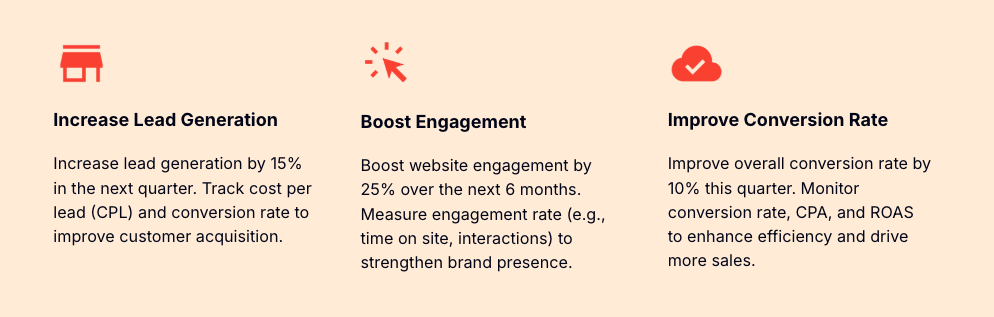
This layout is ideal for showcasing icons or headshots. Use a three or more column setup to display them side by side, adjusting the spacing between columns to ensure a clean and balanced appearance. To keep the layout looking neat on mobile devices, be sure to add a space after each icon, texts or headshot by clicking on the image and pressing ENTER. This helps maintain consistent spacing when the columns stack vertically.
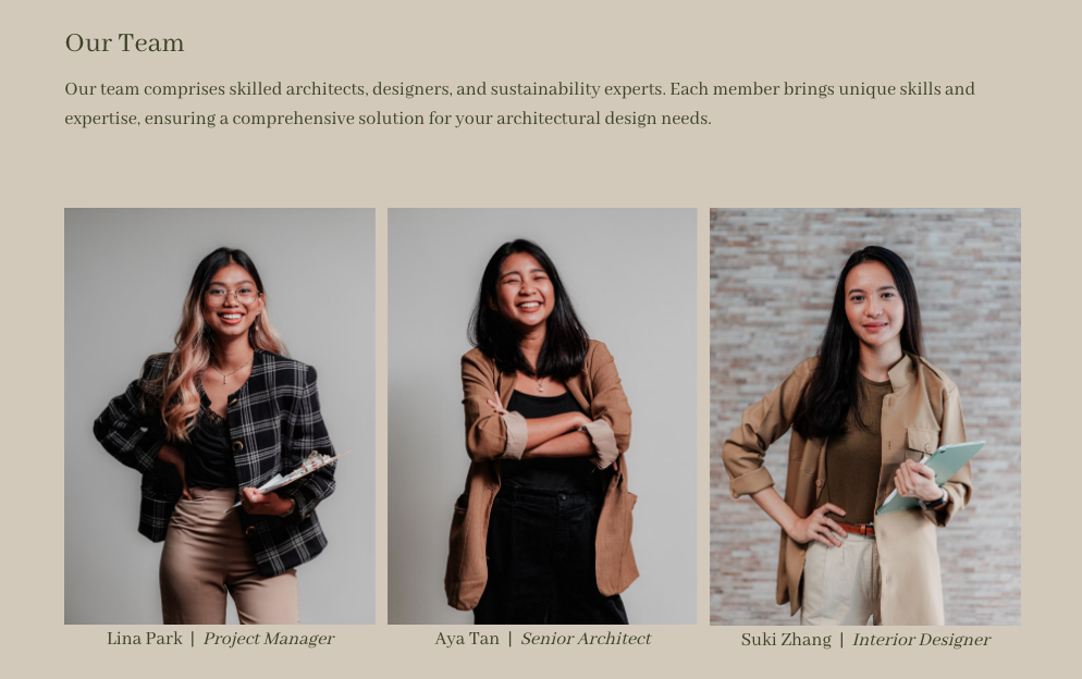
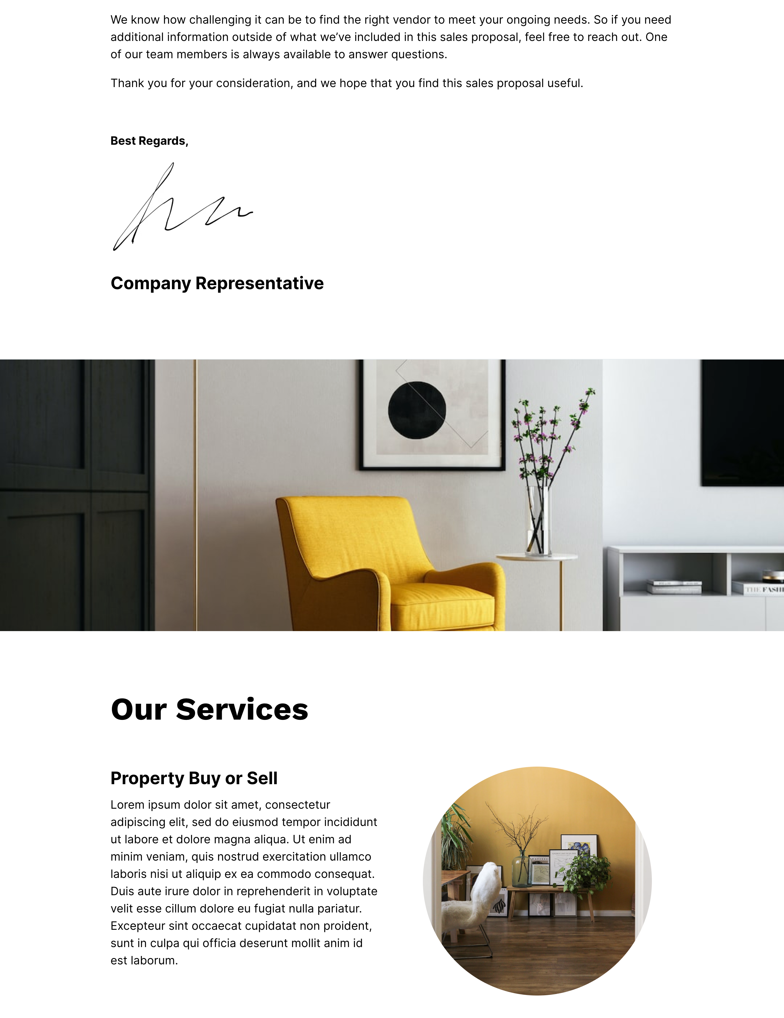
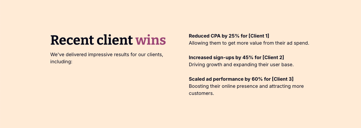
This layout works particularly well for showcasing images alongside text. To set it up, use a two-column format—place the image on one side and the text on the other. For any additional image-text sections, alternate the positions of the image and text to create visual variety and allow each element space to stand out. The result will look something like this:
You can play around with these widgets. Here are some variations:

For more examples and guidance on how to create them, feel free to visit our Templates section or watch our recent design class here.
Tip #9: Splash Breaks
Add headers using splash blocks or create splash blocks that act as white space or visual breaks. These provide resting points for the eyes, making the document easier to read and visually more comfortable.